
Smart Web Design for Indian Businesses
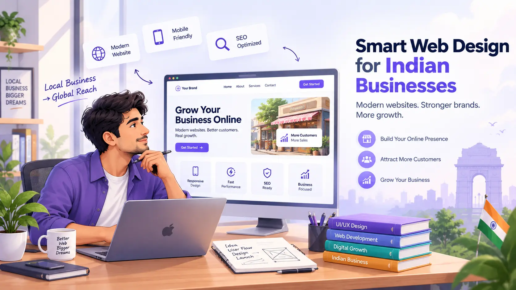
Discover practical web design strategies tailored for Indian businesses to boost UX, conversions, and brand trust without breaking the budget.
Introduction
Web design is far more than mere aesthetics. For Indian businesses navigating a dynamic digital landscape, a website acts as a core strategic tool that directly shapes brand trust, user experience, and conversion rates.
When digital touchpoints serve audiences across varying device tiers, connection speeds, and cultural contexts, design decisions carry immense weight. This guide walks you through practical, cost-effective design strategies aligned with local user behavior and market realities. You will learn how to structure content effectively, engineer for high-performance mobile experiences, and build a scalable design system that supports sustainable growth.
Understanding the Indian Digital Audience
The Indian digital ecosystem is wonderfully diverse, spanning users on flagship devices in metro areas to individuals accessing the web via budget smartphones on variable 4G or 5G connections in tier-2 and tier-3 cities.
Because everyday tasks—from utility bill payments to major purchases—happen predominantly on mobile screens, your design framework must adapt. Prioritize lightning-fast loading times, highly legible typography that remains sharp in bright outdoor lighting, and frictionless navigation. Designing with accessibility in mind ensures that users with varying physical or technological capabilities can access critical information without barriers.
Core Pillars
- Mobile-First Mindset: Architect every user flow and layout for small screens and fluctuating network stability first.
- Radical Clarity: Users should discover key value propositions and primary actions within seconds and a couple of taps.
- Contextual Localization: Language preferences, cultural cues, familiarity with regional payment gateways, and trust markers all drive engagement.
Practical Design Principles for the Indian Market
1. Performance as a Core Feature
In digital commerce and communication, speed is synonymous with credibility. Site speed influences user perception and conversion rates more than any other technical factor.
- Compress and serve images in next-gen formats (such as WebP).
- Implement native lazy loading for off-screen media.
- Keep initial render payloads lean by deferring non-critical scripts and stylesheets.
2. Responsive and Accessible UI
Deliver a fluid, seamless experience across the entire spectrum of screen sizes.
- Utilize fluid CSS grids, scalable modular typography, and generous, finger-friendly touch targets (minimum 48x48px).
- Ensure strict color contrast ratios to meet WCAG standards, and support full keyboard navigation for power users.
3. Clear Visual Hierarchy
Cognitive overload kills conversions. Establish a powerful focal point above the fold, anchored by a single, prominent primary Call-to-Action (CTA). Leverage scale, strategic color contrast, and ample whitespace to naturally guide the visitor's eye down the page toward your conversion goals.
4. Content-Driven Architecture
Your layout should serve your content, never the other way around. Headlines, clear benefit statements, and trust signals (such as verified case studies or peer testimonials) must be visually distinct and scannable. Make it effortless for busy visitors to absorb essential messages in seconds.
5. Local SEO and Semantic HTML
Structure your pages using clean semantic HTML5 tags (header, main, nav, section, article, footer). Use a strict hierarchical heading structure (H1 through H3) to help search engines accurately index your content. Implement structured data (JSON-LD schema) for products, local services, and customer reviews to enhance search visibility.
Visual Design and Brand Consistency
A cohesive visual system builds subconscious trust and brand equity. Define a disciplined design language anchored by a restrained color palette, thoughtful typography pairings, and a reusable component library. Reusing UI components like cards, input fields, and buttons drastically reduces cognitive friction for returning users while accelerating development cycles.
Typography and Color Psychology
Select clean, highly legible typefaces with robust font-weight options. In bright environments common across India, adequate contrast and font sizing are non-negotiable for readability. Use brand accent colors sparingly and intentionally to draw focus to interactive elements and important interface states.
Imagery and Content Balance
Visuals should actively advance your narrative rather than act as decorative filler. Utilize authentic imagery that reflects your actual customer base rather than sterile, generic stock photography that dilutes brand personality.
Accessibility and Inclusivity
Digital inclusion expands your market reach. Ensure your website serves everyone equitably by incorporating descriptive alternative text for all informative images, clear transcripts or captions for multimedia assets, and properly associated form labels. Where applicable, provide multilingual toggles or localized content variations to serve regional audiences natively.
Practical Implementation Plan
- Audit Baseline Performance: Evaluate your current site architecture, speed, and accessibility using diagnostic tools like Google Lighthouse.
- Execute a Minimal Viable Redesign: Focus initial efforts on streamlining the hero section, clarifying your core value proposition, and refining the primary CTA.
- Establish a Component Library: Build a lightweight, modular design system with reusable UI components and design tokens.
- Deploy Responsive Patterns: Roll out mobile-optimized, accessible layout patterns systematically across key landing and conversion pages.
- Monitor and Iterate: Establish continuous performance tracking and gather qualitative user feedback to drive iterative enhancements.
Step-by-Step: From Wireframe to Live Site
- Wireframing: Sketch layouts rooted strictly in user tasks and mobile ergonomics.
- Design System Integration: Translate wireframes into tokens, typography rules, and reusable UI components.
- Performant Development: Code with a strict performance budget, optimizing asset delivery and CSS/JS execution.
- Launch & Feedback Loop: Deploy to production while establishing telemetry to monitor user behavior, drop-off points, and conversion frictions.
Key Performance Indicators (KPIs) to Track
- Technical Metrics: Time to Interactive (TTI), First Contentful Paint (FCP), and Cumulative Layout Shift (CLS).
- Engagement Metrics: Mobile bounce rate, session duration, and completion rates for key user journeys.
- Business Metrics: Overall conversion rate, cost per acquisition, and task success rate.
- Quality Metrics: Accessibility audit scores and qualitative user satisfaction indexes.
Quick Wins for Immediate Impact
- Simplify your homepage hero section down to a single, unmistakable CTA above the fold.
- Compress heavy images and enable native lazy loading across all blog posts and product pages.
- Implement a clean, sticky mobile header for effortless navigation.
- Integrate immediate trust signals—such as client logos, security badges, or concise customer testimonials—near conversion buttons.
Final Takeaways
A masterfully designed website tailored for Indian audiences bridges the gap between technical performance, uncompromising clarity, and cultural resonance. By prioritizing mobile usability, accessible patterns, and a coherent design system, your digital presence transforms from a static brochure into a high-performing growth engine that scales seamlessly alongside your business.